import pandas as pdimport numpy as np# import chart_studio.plotly as py# import cufflinks as cfimport seaborn as snsimport plotly.express as px%matplotlib inlineimport warningswarnings.filterwarnings('ignore')# Make Plotly work in your Jupyter Notebookfrom plotly.offline import download_plotlyjs, init_notebook_mode, plot, iplotinit_notebook_mode(connected=True)# Use Plotly locally# cf.go_offline()
c:\Users\benlu\anaconda3\envs\nbdev\lib\site-packages\scipy\__init__.py:146: UserWarning: A NumPy version >=1.16.5 and <1.23.0 is required for this version of SciPy (detected version 1.24.1
warnings.warn(f"A NumPy version >={np_minversion} and <{np_maxversion}"
Basics
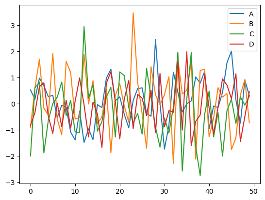
# Create a dataframe using a NumPy array that is 50 by 4arr_1 = np.random.randn(50, 4)df_1 = pd.DataFrame(arr_1, columns=['A','B','C','D'])df_1.head()# Compare old plots to a Plotly interactive plot# You can save as PNG, Zoom, Pan, Turn off & on Data and moredf_1.plot()
<AxesSubplot: >
Line Plots
# Allows us to create graph objects for making more customized plotsimport plotly.graph_objects as go# Use included Google price data to make one plotdf_stocks = px.data.stocks()px.line(df_stocks, x='date', y='GOOG', labels={'x':'Date', 'y':'Price'})# Make multiple line plotspx.line(df_stocks, x='date', y=['GOOG','AAPL'], labels={'x':'Date', 'y':'Price'}, title='Apple Vs. Google')# Create a figure to which I'll add plotsfig = go.Figure()# You can pull individual columns of data from the dataset and use markers or notfig.add_trace(go.Scatter(x=df_stocks.date, y=df_stocks.AAPL, mode='lines', name='Apple'))fig.add_trace(go.Scatter(x=df_stocks.date, y=df_stocks.AMZN, mode='lines+markers', name='Amazon'))# You can create custom lines (Dashes : dash, dot, dashdot)fig.add_trace(go.Scatter(x=df_stocks.date, y=df_stocks.GOOG, mode='lines+markers', name='Google', line=dict(color='firebrick', width=2, dash='dashdot')))# Further style the figure# fig.update_layout(title='Stock Price Data 2018 - 2020',# xaxis_title='Price', yaxis_title='Date')# Go crazy styling the figurefig.update_layout(# Shows gray line without grid, styling fonts, linewidths and more xaxis=dict( showline=True, showgrid=False, showticklabels=True, linecolor='rgb(204, 204, 204)', linewidth=2, ticks='outside', tickfont=dict( family='Arial', size=12, color='rgb(82, 82, 82)', ), ),# Turn off everything on y axis yaxis=dict( showgrid=False, zeroline=False, showline=False, showticklabels=False, ), autosize=False, margin=dict( autoexpand=False, l=100, r=20, t=110, ), showlegend=False, plot_bgcolor='white')
Bar Charts
# Get population change in US by querying for US datadf_us = px.data.gapminder().query("country == 'United States'")px.bar(df_us, x='year', y='pop')# Create a stacked bar with more customizationdf_tips = px.data.tips()px.bar(df_tips, x='day', y='tip', color='sex', title='Tips by Sex on Each Day', labels={'tip': 'Tip Amount', 'day': 'Day of the Week'})# Place bars next to each otherpx.bar(df_tips, x="sex", y="total_bill", color='smoker', barmode='group')# Display pop data for countries in Europe in 2007 greater than 2000000df_europe = px.data.gapminder().query("continent == 'Europe' and year == 2007 and pop > 2.e6")fig = px.bar(df_europe, y='pop', x='country', text='pop', color='country')# Put bar total value above bars with 2 values of precisionfig.update_traces(texttemplate='%{text:.2s}', textposition='outside')# Set fontsize and uniformtext_mode='hide' says to hide the text if it won't fitfig.update_layout(uniformtext_minsize=8)# Rotate labels 45 degreesfig.update_layout(xaxis_tickangle=-45)
Scatter Plot
# Use included Iris data setdf_iris = px.data.iris()# Create a scatter plot by defining x, y, different color for count of provided# column, size based on supplied column and additional data to display on hoverpx.scatter(df_iris, x="sepal_width", y="sepal_length", color="species", size='petal_length', hover_data=['petal_width'])# Create a customized scatter with black marker edges with line width 2, opaque# and colored based on width. Also show a scale on the rightfig = go.Figure()fig.add_trace(go.Scatter( x=df_iris.sepal_width, y=df_iris.sepal_length, mode='markers', marker_color=df_iris.sepal_width, text=df_iris.species, marker=dict(showscale=True)))fig.update_traces(marker_line_width=2, marker_size=10)# Working with a lot of data use Scatterglfig = go.Figure(data=go.Scattergl( x = np.random.randn(100000), y = np.random.randn(100000), mode='markers', marker=dict( color=np.random.randn(100000), colorscale='Viridis', line_width=1 )))fig
Pie Charts
# Create Pie chart of the largest nations in Asia# Color maps here plotly.com/python/builtin-colorscales/df_samer = px.data.gapminder().query("year == 2007").query("continent == 'Asia'")px.pie(df_samer, values='pop', names='country', title='Population of Asian continent', color_discrete_sequence=px.colors.sequential.RdBu)# Customize pie chartcolors = ['blue', 'green', 'black', 'purple', 'red', 'brown']fig = go.Figure(data=[go.Pie(labels=['Water','Grass','Normal','Psychic', 'Fire', 'Ground'], values=[110,90,80,80,70,60])])# Define hover info, text size, pull amount for each pie slice, and strokefig.update_traces(hoverinfo='label+percent', textfont_size=20, textinfo='label+percent', pull=[0.1, 0, 0.2, 0, 0, 0], marker=dict(colors=colors, line=dict(color='#FFFFFF', width=2)))
Histograms
# Plot histogram based on rolling 2 dicedice_1 = np.random.randint(1,7,5000)dice_2 = np.random.randint(1,7,5000)dice_sum = dice_1 + dice_2# bins represent the number of bars to make# Can define x label, color, title# marginal creates another plot (violin, box, rug)fig = px.histogram(dice_sum, nbins=11, labels={'value':'Dice Roll'}, title='5000 Dice Roll Histogram', marginal='violin', color_discrete_sequence=['green'])fig.update_layout( xaxis_title_text='Dice Roll', yaxis_title_text='Dice Sum', bargap=0.2, showlegend=False)# Stack histograms based on different column datadf_tips = px.data.tips()px.histogram(df_tips, x="total_bill", color="sex")
Box Plots
# A box plot allows you to compare different variables# The box shows the quartiles of the data. The bar in the middle is the median # The whiskers extend to all the other data aside from the points that are considered# to be outliersdf_tips = px.data.tips()# We can see which sex tips the most, points displays all the data pointspx.box(df_tips, x='sex', y='tip', points='all')# Display tip sex data by daypx.box(df_tips, x='day', y='tip', color='sex')# Adding standard deviation and meanfig = go.Figure()fig.add_trace(go.Box(x=df_tips.sex, y=df_tips.tip, marker_color='blue', boxmean='sd'))# Complex Stylingdf_stocks = px.data.stocks()fig = go.Figure()# Show all points, spread them so they don't overlap and change whisker widthfig.add_trace(go.Box(y=df_stocks.GOOG, boxpoints='all', name='Google', fillcolor='blue', jitter=0.5, whiskerwidth=0.2))fig.add_trace(go.Box(y=df_stocks.AAPL, boxpoints='all', name='Apple', fillcolor='red', jitter=0.5, whiskerwidth=0.2))# Change background / grid colorsfig.update_layout(title='Google vs. Apple', yaxis=dict(gridcolor='rgb(255, 255, 255)', gridwidth=3), paper_bgcolor='rgb(243, 243, 243)', plot_bgcolor='rgb(243, 243, 243)')
Violin Plot
# Violin Plot is a combination of the boxplot and KDE# While a box plot corresponds to data points, the violin plot uses the KDE estimation# of the data pointsdf_tips = px.data.tips()px.violin(df_tips, y="total_bill", box=True, points='all')# Multiple plotspx.violin(df_tips, y="tip", x="smoker", color="sex", box=True, points="all", hover_data=df_tips.columns)# Morph left and right sides based on if the customer smokesfig = go.Figure()fig.add_trace(go.Violin(x=df_tips['day'][ df_tips['smoker'] =='Yes' ], y=df_tips['total_bill'][ df_tips['smoker'] =='Yes' ], legendgroup='Yes', scalegroup='Yes', name='Yes', side='negative', line_color='blue'))fig.add_trace(go.Violin(x=df_tips['day'][ df_tips['smoker'] =='No' ], y=df_tips['total_bill'][ df_tips['smoker'] =='No' ], legendgroup='Yes', scalegroup='Yes', name='No', side='positive', line_color='red'))
Density Heatmap
# Create a heatmap using Seaborn dataflights = sns.load_dataset("flights")flights# You can set bins with nbinsx and nbinsyfig = px.density_heatmap(flights, x='year', y='month', z='passengers', color_continuous_scale="Viridis")fig# You can add histogramsfig = px.density_heatmap(flights, x='year', y='month', z='passengers', marginal_x="histogram", marginal_y="histogram")fig
3D Scatter Plots
# Create a 3D scatter plot using flight datafig = px.scatter_3d(flights, x='year', y='month', z='passengers', color='year', opacity=0.7, width=800, height=400)fig
# With a scatter matrix we can compare changes when comparing column datafig = px.scatter_matrix(flights, color='month')fig
Map Scatter Plots
# There are many interesting ways of working with maps# plotly.com/python-api-reference/generated/plotly.express.scatter_geo.htmldf = px.data.gapminder().query("year == 2007")fig = px.scatter_geo(df, locations="iso_alpha", color="continent", # which column to use to set the color of markers hover_name="country", # column added to hover information size="pop", # size of markers projection="orthographic")fig
Choropleth Maps
# You can color complex maps like we do here representing unemployment data# Allows us to grab data from a supplied URLfrom urllib.request import urlopen# Used to decode JSON dataimport json# Grab US county geometry datawith urlopen('https://raw.githubusercontent.com/plotly/datasets/master/geojson-counties-fips.json') as response: counties = json.load(response)# Grab unemployment data based on each counties Federal Information Processing numberdf = pd.read_csv("https://raw.githubusercontent.com/plotly/datasets/master/fips-unemp-16.csv", dtype={"fips": str})# Draw map using the county JSON data, color using unemployment values on a range of 12fig = px.choropleth(df, geojson=counties, locations='fips', color='unemp', color_continuous_scale="Viridis", range_color=(0, 12), scope="usa", labels={'unemp':'unemployment rate'} )fig
Polar Chart
# Polar charts display data radially # Let's plot wind data based on direction and frequency# You can change size and auto-generate different symbols as welldf_wind = px.data.wind()px.scatter_polar(df_wind, r="frequency", theta="direction", color="strength", size="frequency", symbol="strength")# Data can also be plotted using lines radially# A template makes the data easier to seepx.line_polar(df_wind, r="frequency", theta="direction", color="strength", line_close=True, template="plotly_dark", width=800, height=400)
Ternary Plot
# Used to represent ratios of 3 variablesdf_exp = px.data.experiment()px.scatter_ternary(df_exp, a="experiment_1", b="experiment_2", c='experiment_3', hover_name="group", color="gender")
Facets
# You can create numerous subplotsdf_tips = px.data.tips()px.scatter(df_tips, x="total_bill", y="tip", color="smoker", facet_col="sex")# We can line up data in rows and columnspx.histogram(df_tips, x="total_bill", y="tip", color="sex", facet_row="time", facet_col="day", category_orders={"day": ["Thur", "Fri", "Sat", "Sun"], "time": ["Lunch", "Dinner"]})# This dataframe provides scores for different students based on the level# of attention they could provide during testingatt_df = sns.load_dataset("attention")fig = px.line(att_df, x='solutions', y='score', facet_col='subject', facet_col_wrap=5, title='Scores Based on Attention')fig
Animated Plots
# Create an animated plot that you can use to cycle through continent# GDP & life expectancy changesdf_cnt = px.data.gapminder()px.scatter(df_cnt, x="gdpPercap", y="lifeExp", animation_frame="year", animation_group="country", size="pop", color="continent", hover_name="country", log_x=True, size_max=55, range_x=[100,100000], range_y=[25,90])# Watch as bars chart population changespx.bar(df_cnt, x="continent", y="pop", color="continent", animation_frame="year", animation_group="country", range_y=[0,4000000000])